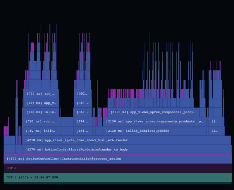
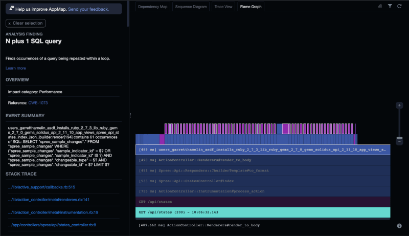
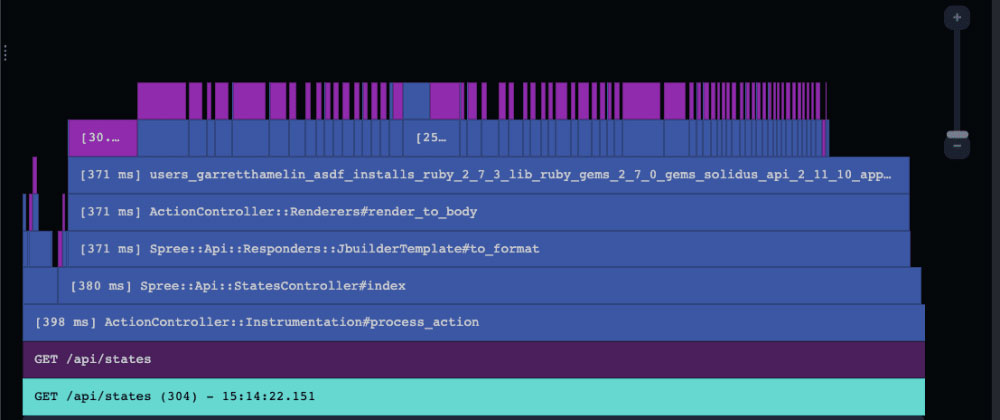
Flame graphs help developers identify code bottlenecks and understand code execution patterns, so we’re excited to announce they are now available within the AppMap extension for VS Code and JetBrains editors like IntelliJ.
“Flame graphs are a visualization of hierarchical data, created to visualize stack traces of profiled software so that the most frequent code-paths to be identified quickly and accurately.”
In this article, I explore how they work, and how to generate and use them with AppMap.
How to read a flame graph
Flame graphs are read from bottom to top, left to right, providing a holistic view of function execution. In this video, you can see how I identify time-consuming functions and visualize the sequence of operations.
To make sense of the flame graphs, we must first understand the color scheme.
- Purple represents
SQL queries - Blue indicates
classes,methods, orfunctionsthat follow in the execution flow - Yellow denotes
external service calls(absent in this video) - Teal is the name of the AppMap
What you get with flame graphs
Flame Graphs reveal crucial insights about application performance. Each function in the graph is labeled with its corresponding execution time in milliseconds or microseconds. This detailed breakdown allows developers to pinpoint long-running queries and functions, optimizing code efficiency.

Zooming in on the graph or selecting a specific function provides a deeper understanding of the call stack and execution sequence. For example, the demonstration showcased the occurrence of a selector before an active support call, shedding light on the execution flow. This level of granularity empowers developers to tackle complex performance issues head-on.
Revealing performance issues
By examining the graph, developers can detect common issues like N+1 queries, a notorious problem in application development. The ability to visualize the duration of each query or function provides actionable insights, highlighting areas for improvement.

Flame graphs also expose the impact of long-running functions on overall performance. While some functions, like renders to body, are intended to run longer, others such as support services and callbacks, should be optimized for efficiency. The graph’s tally of execution times offers a comprehensive overview, ensuring developers can focus their efforts where they matter most.
AppMap improves on flame graphs by highlighting the flaws in your application and shows you the direct impact of a specific flaw on your application. No more searching to figure out where an N+1 query happened or how many times it ran!
Flame graphs, sequence diagrams, and more
Try AppMap today to help you identify issues with your code or refactor an existing code base. Use our new flame graph and sequence diagram views. We also have traditional dependency and trace views.
Links
- ⬇️ Download AppMap for VSCode and JetBrains
- ⭐ Star AppMap on GitHub
- 🐦 Follow on Twitter
- 💬 Join AppMap Slack
- ℹ️ Read the AppMap docs
- 📺 Watch AppMap Tutorials
