Using AppMap Diagrams
AppMap records code execution traces, collecting information about how your code works and what it does. Then it presents this information as interactive diagrams that you can search and navigate. In the diagrams, you can see exactly how functions, web services, data stores, security, I/O, and dependent services all work together when application code runs.
You use AppMap right in your code editor, using the AppMap extension for your code editor. AppMap Diagrams also link directly to code, so you can use the information in the diagrams to make immediate code changes and improvements.
How it Works
AppMap records the behavior of running code into JSON files, and visualizes them in interactive diagrams right in your code editor.
Install and configure the AppMap agent for your language

AppMap agent records executing code as JSON files

The AppMap extension for your code editor displays AppMap Data as interactive diagrams

AppMap agent records executing code as JSON files
Once your app is instrumented, the AppMap agent creates JSON files as you execute test cases, run sample programs, or perform interactive sessions with your app.
AppMap Data can be most conveniently recorded from automated tests, but other methods of recording are preferred in certain situations, such as direct recording of code blocks or remote recording controlled with REST endpoints. Learn more about Recording AppMap Data.
Quick search for HTTP routes, packages, classes, and functions in the left-hand navigation bar
Use the navigation bar for quick navigation to items of interest, for example, HTTP routes, labels, packages, classes, functions.
Use the filtering icon to reduce the number of objects in the AppMap view
Filter out items such as unlabeled code, specific classes or packages, external code, and more.
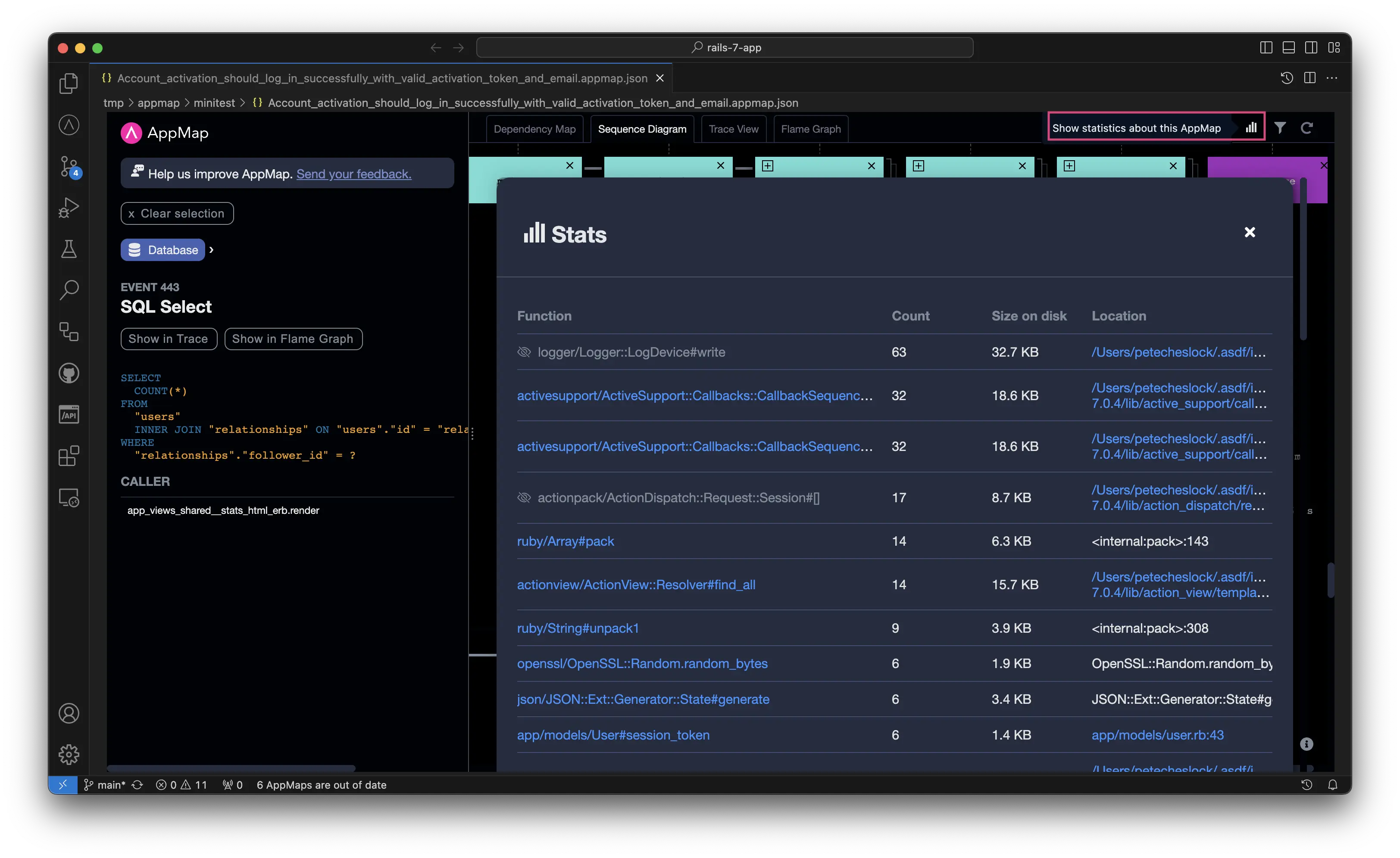
Show more detailed statistics about your AppMap
Includes the frequency of specific function calls and the size represented within the AppMap. This is helpful when handling large AppMap Diagrams and to reduce their size.
Expand and Collapse the Depth of Sequence Diagrams
This will hide or show all actions that are deeper in the call stack than the selected value, and will result in a more compact diagram. Actions can be expanded or collapsed with the + or - controls to change the depth of the calls shown within your sequence diagram.
Demo of using AppMap Diagrams
This video demonstrates how to use AppMap Diagrams when learning how unfamiliar code works:
Dependency Map
The Dependency Map diagram shows all the code that’s relevant to what you’re working on and how it’s connected. Here you can search and navigate through web services, code, libraries, dependency services, and SQL, all in the context of a specific feature.
The dependency map is fully interactive. You can:
- Expand and collapse packages and Web Service endpoints
- View detailed information about dependencies and classes
- List the functions of a class that are used by the executed code
- Explore callers and callees
- View SQL queries in dependency map
- Open source code right to the line of any particular function.
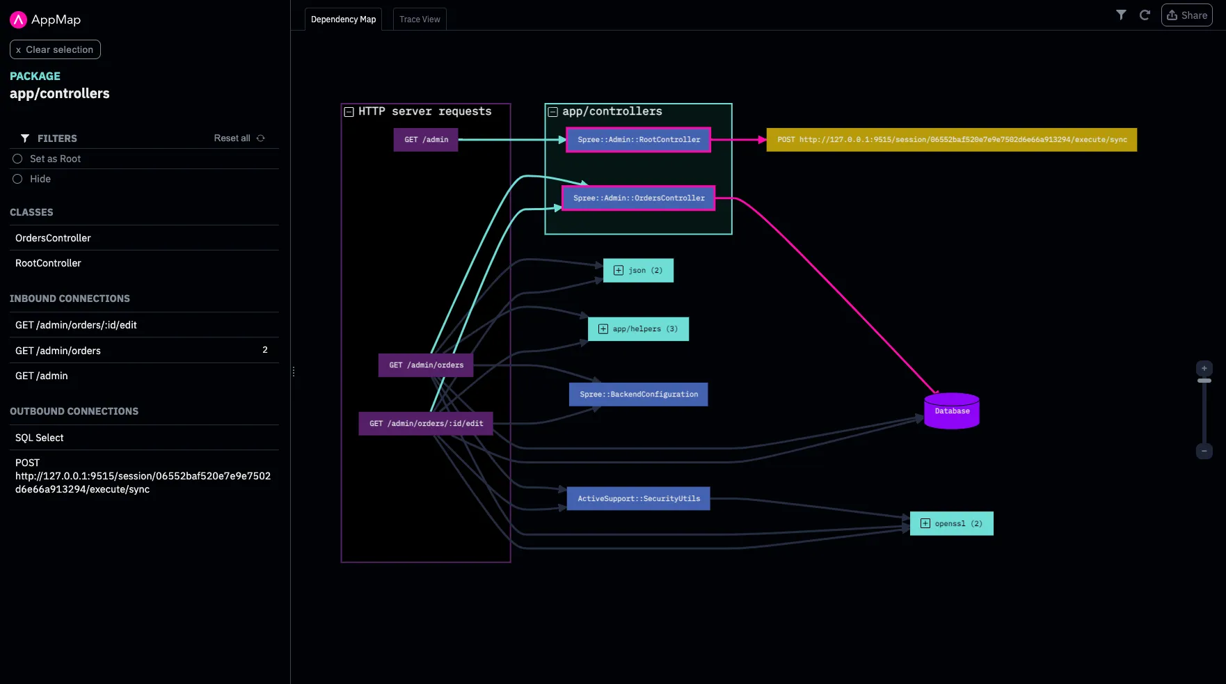
Expand and collapse packages and Web Service endpoints:
View detailed information about dependencies and classes:
List the functions of a class that are used by the executed code:
Explore callers and callees:
View SQL queries in dependency map:
Open source code right to the line of any particular function:
Trace View
The Trace view diagram shows all the details of how a feature works. Here you can navigate forward, backward, up, and down through a detailed execution trace. See the call tree starting with web service endpoints going through function calls all the way to SQL operations. At any point, you can move quickly back and forth between the Trace view and your source code.
The Trace view is fully interactive. You can:
- Expand and collapse execution paths
- Explore callers and callees
- View variable names and values at any point in the code flow
- View SQL queries
- Open source code right to the line of any particular function
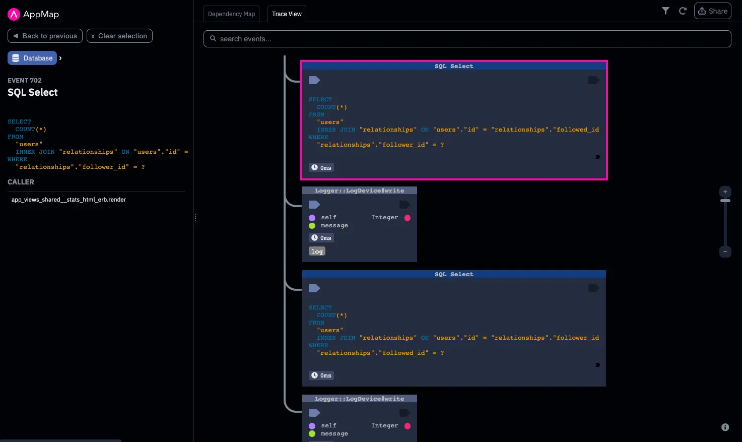
Expand and collapse execution paths
Explore callers and callees
View variable names and values at any point in the code flow
View SQL queries
Open source code right to the line of any particular function
Sequence Diagram
“A sequence diagram shows process interactions arranged in time sequence in the field of software engineering. It depicts the processes involved and the sequence of messages exchanged between the processes needed to carry out the functionality.“1
The Sequence Diagram view shows an application’s behavior in a linear chronological layout. Function calls are shown as horizontal arrows, ordered from top to bottom as they occurred at runtime. The elements in the sequence diagram are interactive and can be selected, collapsed, and hidden.
Sequence diagrams can also be exported as SVG files for easy sharing and collaboration. Similar AppMap Diagrams can also be compared in a sequence diagram “diff” to reveal changes in runtime behavior caused by a code update.
However, like all forms of documentation, a sequence diagram is only useful when it is current and accurate. AppMap gives you the ability to instantly generate sequence diagrams of any recorded program. A generated sequence diagram is accurate and easy to produce, and it can be re-created on demand. The sequence diagram format is described in the UML standard.
You can use AppMap to view and interact with sequence diagrams of your application right in your code editor. AppMap can also generate sequence diagrams comparisons to make it easy to see the differences in runtime behavior caused by a coding change.
Sequence diagrams can be also exported as SVG images, or in popular text formats like PlantUML so that you can edit and share the diagrams however you prefer. AppMap sequence diagrams can also be generated on the command line, making it simple to use within a CI build to generate up-to-date sequence diagrams every time a change is made on your primary development branches.
Viewing sequence diagrams in the code editor
The AppMap extensions for Visual Studio Code and JetBrains include support for viewing AppMap Data as sequence diagrams. Simply open any AppMap and click on the Sequence Diagram tab to view it in the main editor window.
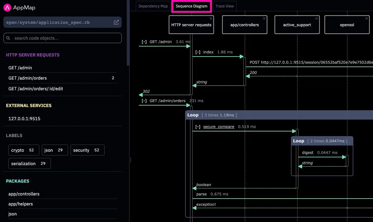
Sequence Diagrams follow these conventions:
- Inbound HTTP server requests (if any) will be on the left hand side
- Database queries and RPC requests (e.g. HTTP client requests) (if any) will be on the right hand side.
- Each code package is represented as a sequence diagram “lifeline”. Each lifeline is a vertical lane which you can follow down the page.
- Each function call is represented as a line from one lifeline to another.
- The function return value (if any) will be depicted in the opposite direction.
- If an AppMap contains HTTP server requests, other “root” events which are not HTTP server requests will be filtered out, by default.
Scrolling down within a sequence diagram in the editor retains the lifeline labels at the top, making it easy to keep track of which vertical line belongs to which entity. You can select function calls to see their details, or to see the same event in Trace View for even more detail.
Removing lifelines from view
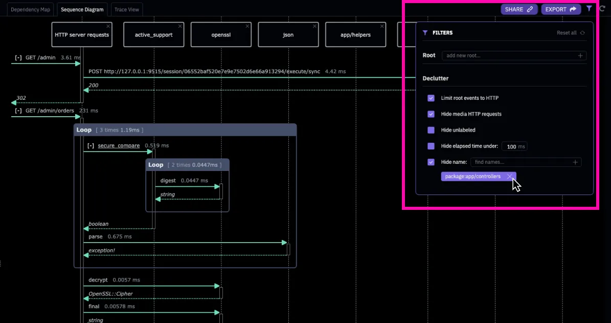
By default, AppMap Sequence Diagrams will contain “lifelines” for each of the actors in your application. If you would prefer not to see any of those, just click on the “X” within the lifeline label to remove it. This can be useful when hiding less important calls such as those to made a central logging package.
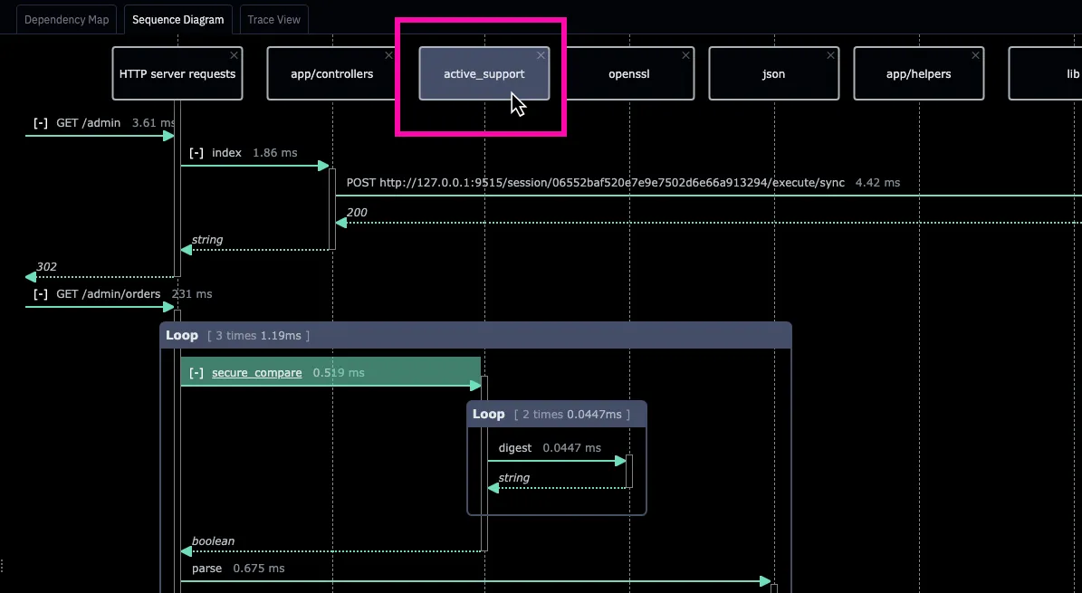
Lifelines that have been hidden can be re-shown using the “Filters” control, or by resetting the map using the “Clear” control.
Collapsing sections of a Sequence Diagram
Function calls that contain other events can be collapsed to make the diagram easier to read. This is done using the [-] control.
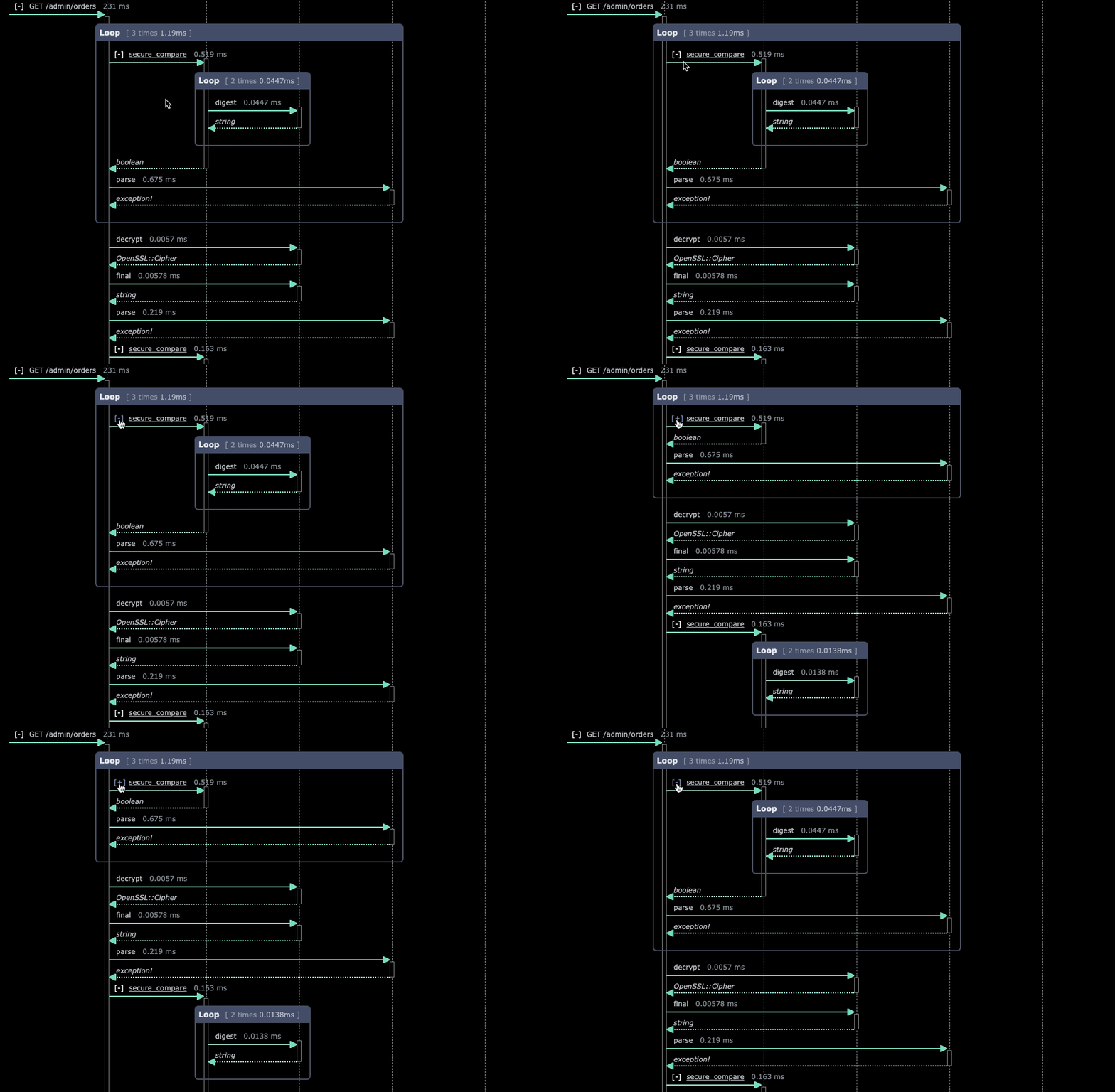
Clicking on the [+] control will expand the same sequence set once again.
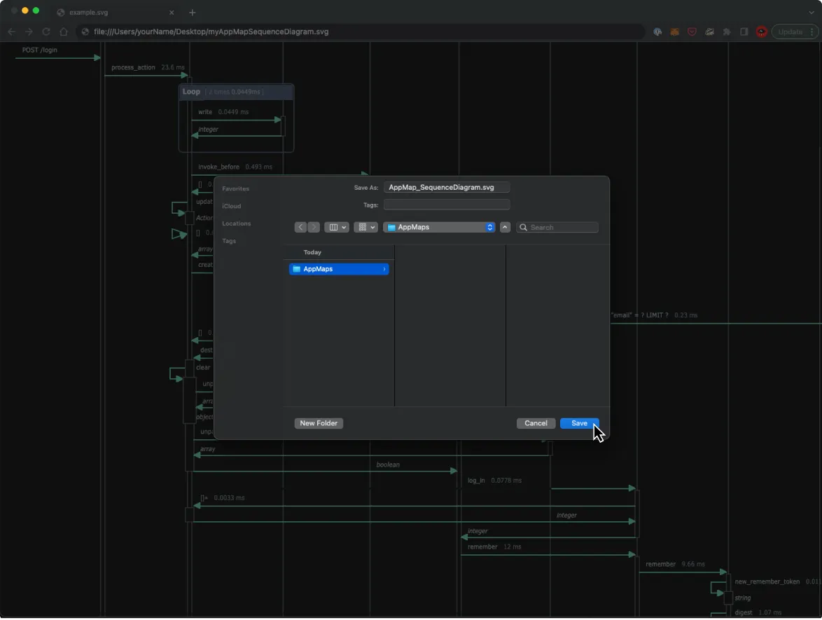
Exporting sequence diagrams as SVG files
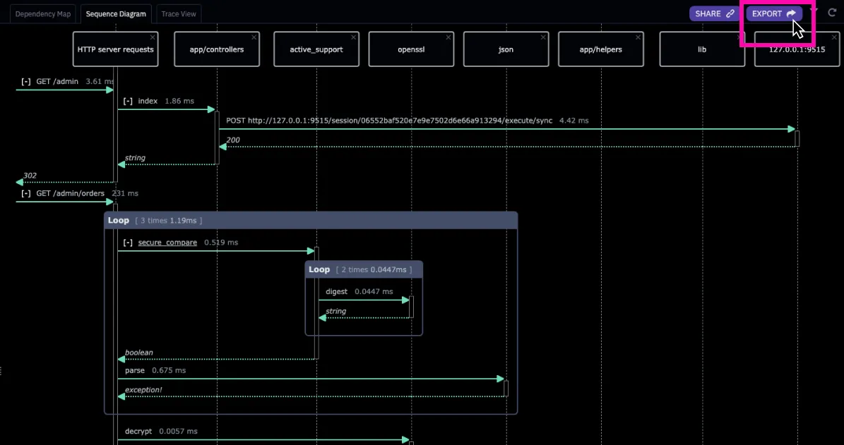
Sequence diagrams can be exported from the code editor as SVG image files. Any lifelines that are hidden from view will also not appear in the exported image.
To export a sequence diagram, click on EXPORT and the SVG data will appear in a new file in your project. Save that file to a desired location and then open it with a web browser or other suitable tool to view it.
3rd Party Integrations
Refer to the AppMap integration documentation to learn more about how to integrate Sequence Diagrams with PlantUML and other 3rd party tools.
Notes
Flame Graph
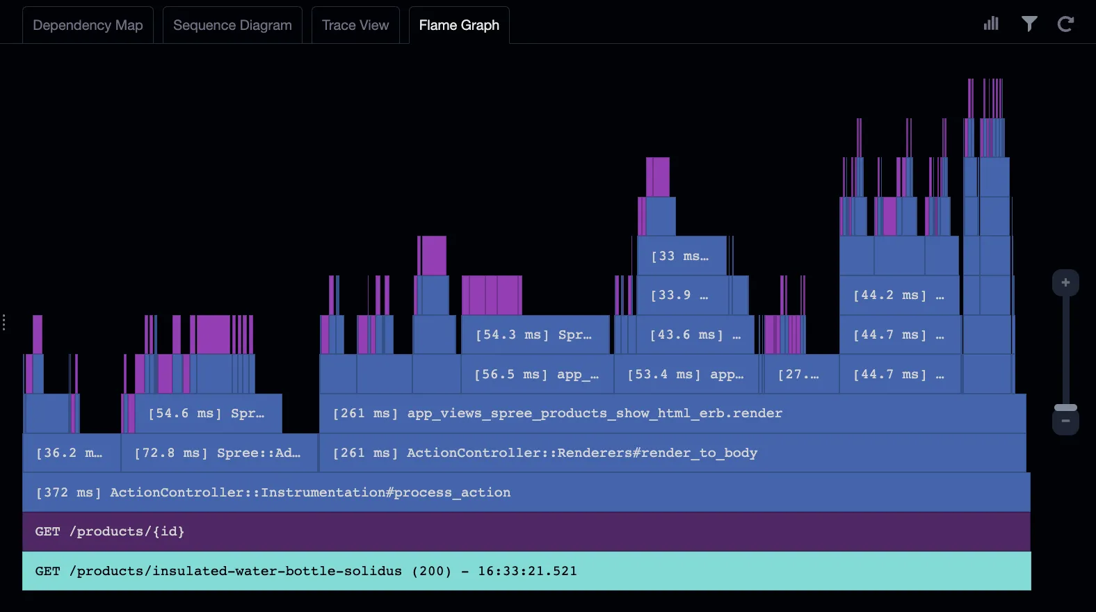
Flame Graphs visualize the performance of your application’s code. A Flame Graph shows the time spent in each part of your application’s call stack, where the width of the event is proportional to how long it takes to execute.
Flame Graphs make it easy to see how much time is spent in each function, and which calls are the most expensive.
How to read a Flame Graph
The lowest layer in a Flame Graph represents the AppMap Data recording, and it contains the recordings’s name. For an AppMap Flame Graph created from tests, this will usually be the same name as the test from which it was generated. In the example below, the AppMap was recorded from a test related to an application’s account activation capability.
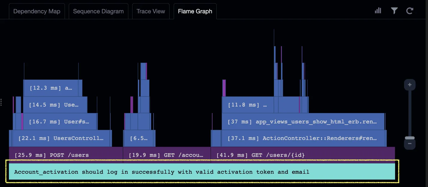
Events in a Flame Graph are ordered bottom-up for functions calling other functions, and left-to-right for subsequent calls. To illustrate, the events in the map below are numbered according to the sequence in which they occurred.

Cells in the flame graph are colored similarly to how they appear in the other AppMap views like the Dependency Map and Sequence Diagram. Blue represents classes, purple represents database queries, and yellow represents outgoing calls to other services. The lowest level of the Flame Graph, the map name, is colored teal.
Each event cell also shows the elapsed time spent executing it. This may be displayed in ms (milliseconds) or µ (microseconds).
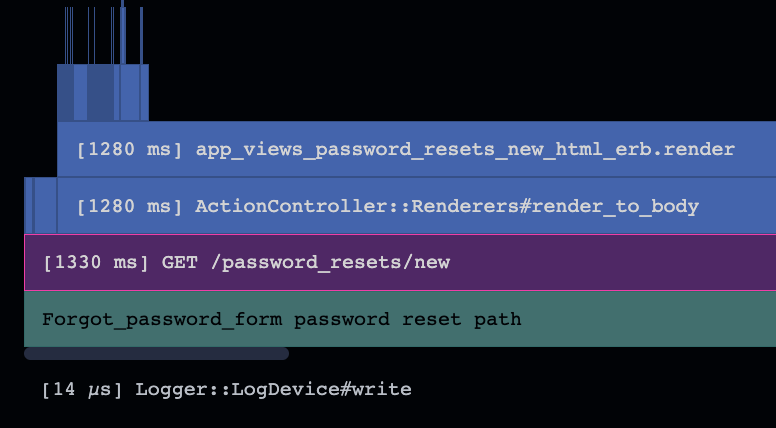
Timing data and event names may not always fit on small cells. These can be revealed by hovering your mouse pointer over the cell.
Drilling Down
It can be useful to zoom into particular parts of the call stack to examine the performance of certain functions more closely. Clicking on any event will expand it to the full width, allowing you to more clearly see the functions which it called.
You can also drill deeper into the Flame Graph using the zoom control on the right by clicking on the + and - controls, or by dragging the zoom bar. You can also zoom using your mouse wheel, and the graph will zoom towards the position of your mouse pointer.
AppMap filter settings also apply to Flame Graphs. For example, if you decide to hide calls to certain types of events (for example, by excluding calls to a logging package) those events will not appear in the Flame Graph.
Switching to Other Views
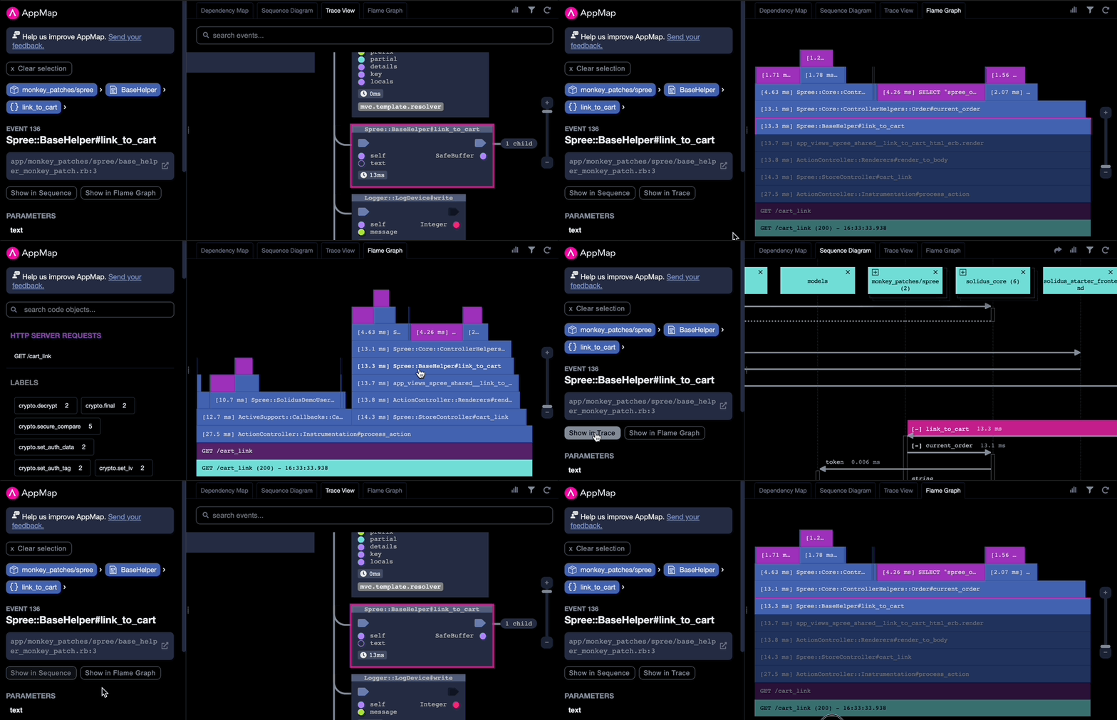
While investigating an event in an application, you can also view the same event in the Sequence Diagram and Trace View diagrams. Click on the event in question, and then select either “Show in Sequence” or “Show in Trace”.
Similarly, you can select an event in a Sequence Diagram or Trace View and click “Show in Flame Graph” to see it displayed in a Flame Graph diagram.
Identifying Performance Issues
Certain performance problems can be visually easier to spot with a Flame Graph.
Expensive functions and queries
Expensive functions are those that are slow due to them doing a lot of computation and not spending much time waiting on other functions to return. In the example graph shown below, the function at the bottom of the stack is spending most of its 15.1 milliseconds of time waiting for the functions and queries which it called to return. The most expensive area in this stack is therefore the SQL SELECT query at the top which takes 10.3 milliseconds. That query should likely be the focus of any performance optimization effort over the other functions and queries.

N+1 Queries
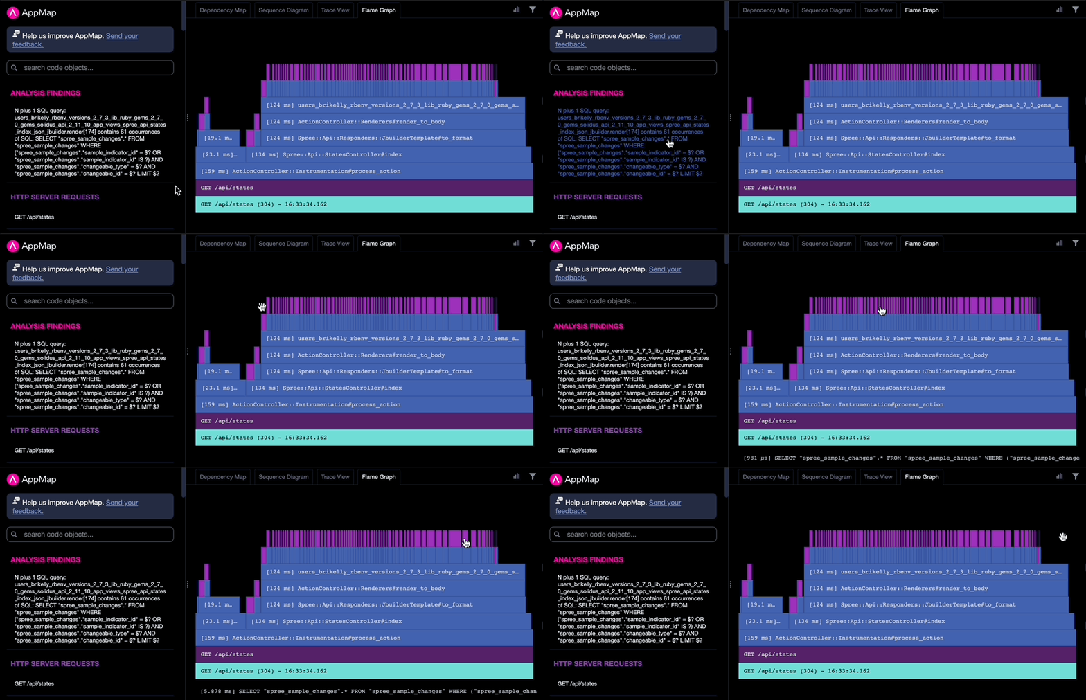
AppMap Analysis automatically detects N+1 queries, which are identical database queries called by the same parent function. In the example graph below, 60 repeated queries are visible at the top of the call stack.
Delays from external service calls
Performance problems can sometimes be caused by latency in external services. In the example graph below, the event in yellow represents a call to another service using HTTP. The call took 936 milliseconds to return, and only a few milliseconds more for the calling function to deal with that. Any optimization efforts for this area should therefore be spent in that other application, preferably by generating an AppMap for its /users API.

